This article engages an audience interested in art history, applied arts' students, and professors. I envision this article being published in an art magazine, or a magazine that explores history and culture like National Geographic. For these reasons, I used typefaces with a serious and elegant feel to them to support the article's aim of informing and educating. These typefaces are Fenice Pro ITC (a modern typeface) and Adobe Caslon Pro (an old-style typeface). Fenice is used to set the headline and author's name because I felt its mechanically precise appearance and high contrast would attract the audience's attention. On the other hand, Caslon's organic characteristics make for an easier reading experience, which is why I applied it to the body copy, pull quote, captions, and folios.
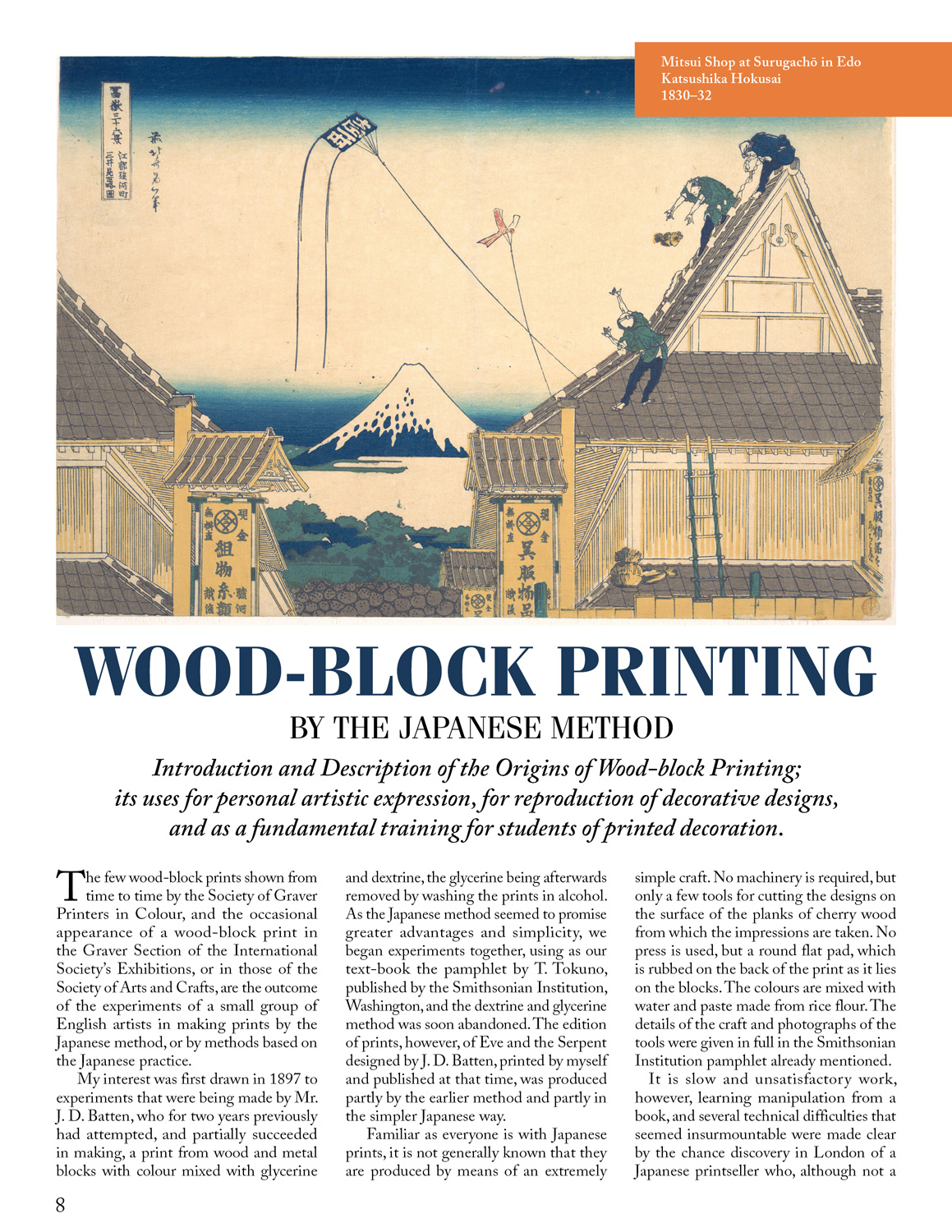
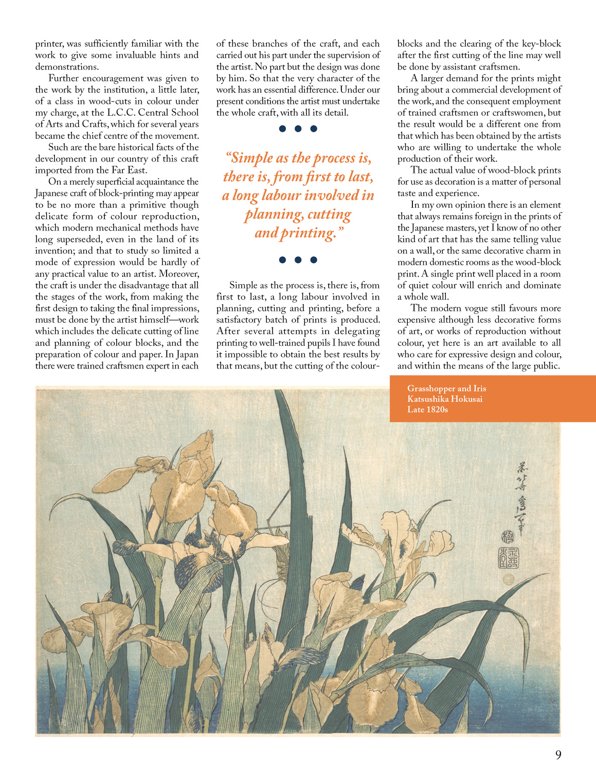
The images chosen to enhance the article add visual interest and context to help the reader relate to the information better. Besides that, I felt that a three-column layout with justified text was most appropriate for this article, given the large amount of information it contains, and the limitations set by the project requirements (the whole article had to be contained within 2 pages).
Software: InDesign
Dimensions: 8.5 x 11 inches